Texas Childcare Connections (Tx3C)
A bold new identity formed by merging two existing Texas Workforce Commission websites under a unified childcare brand — from internal design competition winner to Creative Director.
A new coat of paint
Tx3C represents a bold new identity formed by merging two existing websites under a unified brand. Throughout this process, our team identified several critical challenges, such as excessive information, accessibility issues with visual elements, and a general lack of design cohesion. We viewed these challenges as an exciting opportunity to redefine TWC government childcare websites.
The design team tackled this head-on by developing three unique homepage options, setting the stage for the entire project's design direction. We held an internal competition, and I am proud to say that I won the honor of becoming Creative Director for the remainder of the project.
My pitch
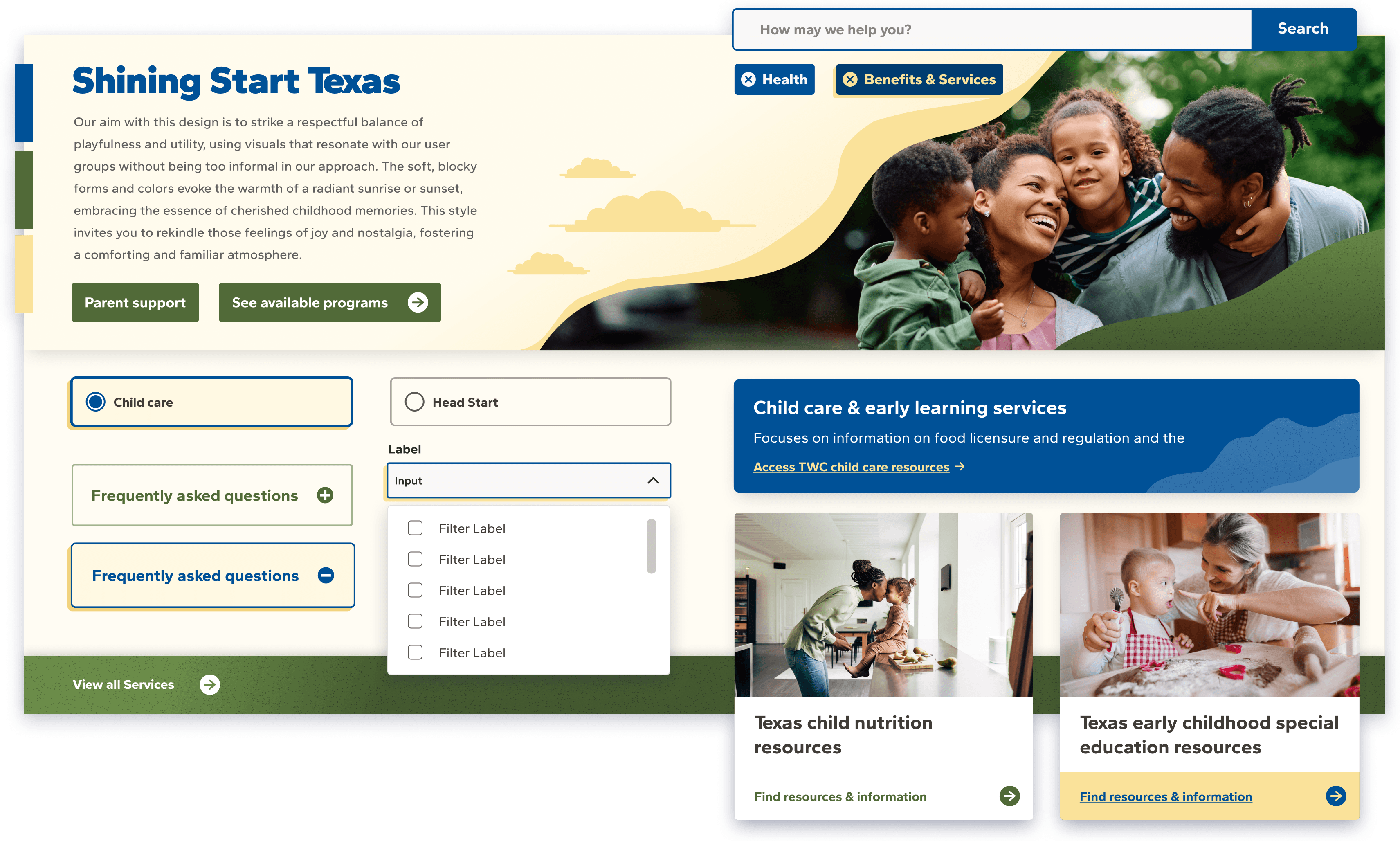
I had the unique opportunity to lead all of our brand workshops during the discovery phase, which provided me with a significant competitive advantage in the design competition. Throughout these workshops, I consistently heard terms such as "endearing," "playful," and "candid" used to describe the desired voice of the website. With my design, I aimed to reflect that voice and differentiate this portal from other websites under the TWC brand. My solution was Shining Start Texas.
Prior to drafting our homepage options, we created a collection of UI mood boards to represent our overall design concept. For the Shining Start Texas concept, I aimed to achieve a respectful balance of playfulness and utility. I used soft, blocky shapes and colors to evoke the warmth of a radiant sunrise or sunset, capturing the essence of cherished childhood memories.
TWC's pivot
Before the dust could settle on our competition, we received news that the client's higher-ups wanted to shift the site's visuals to a more traditional style. This introduced the Tx3C brand, an existing childcare resource portal that was soon to be phased out. This change in direction posed a new challenge for our team: how could we create an exceptional design using this modest existing brand as our foundation?
While the original brand functioned adequately, it was far from ideal. The endearing, playful, and candid voice that emerged during our discovery workshops was mostly muted in the original design. Below, I share my perspective on the previous Tx3C brand, using modified assets that pay homage to the existing site.

Where I landed
Thankfully, despite the changes, the ball was in my court. During our discussions about the mood boards, I noticed that the client team was strongly leaning towards my concept. So, when it was time to refine our final homepage designs, I wanted to incorporate the elements that had been the most successful.
The Response
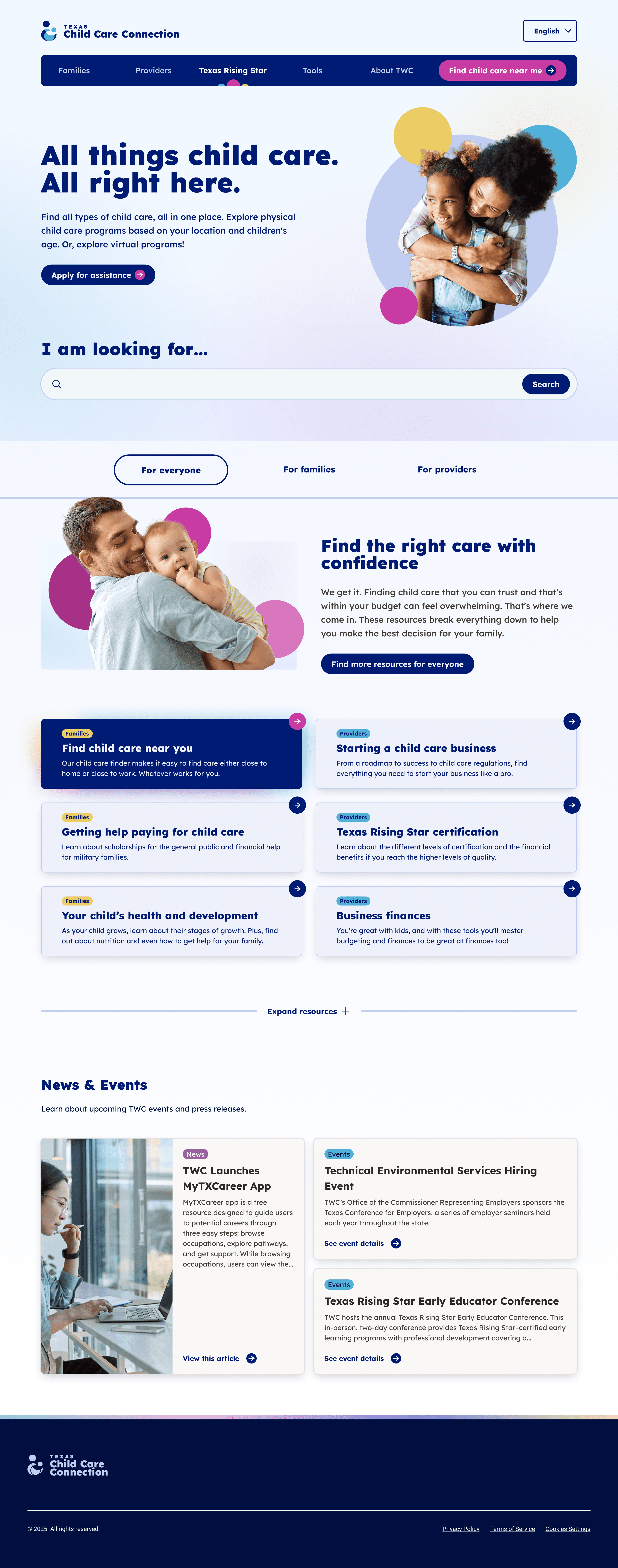
Absolute elation. My new concept, "Blissful Brightness," was a hit. Similar to "Shining Start," this concept emphasizes a strong interplay between playfulness and utility, especially through the use of colors from the palette. I aimed to create soft gradients and incorporated bubble forms (bokeh bubbles) to enhance the site's imagery.